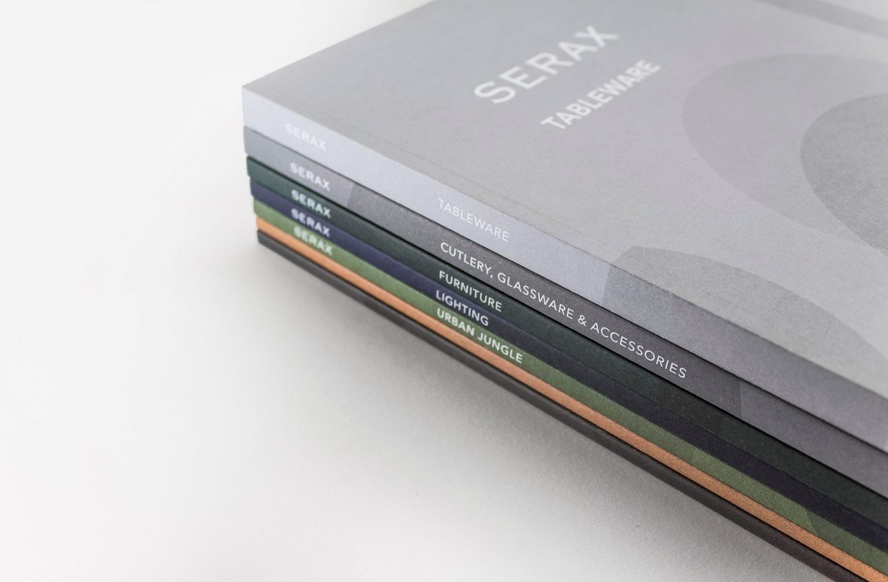
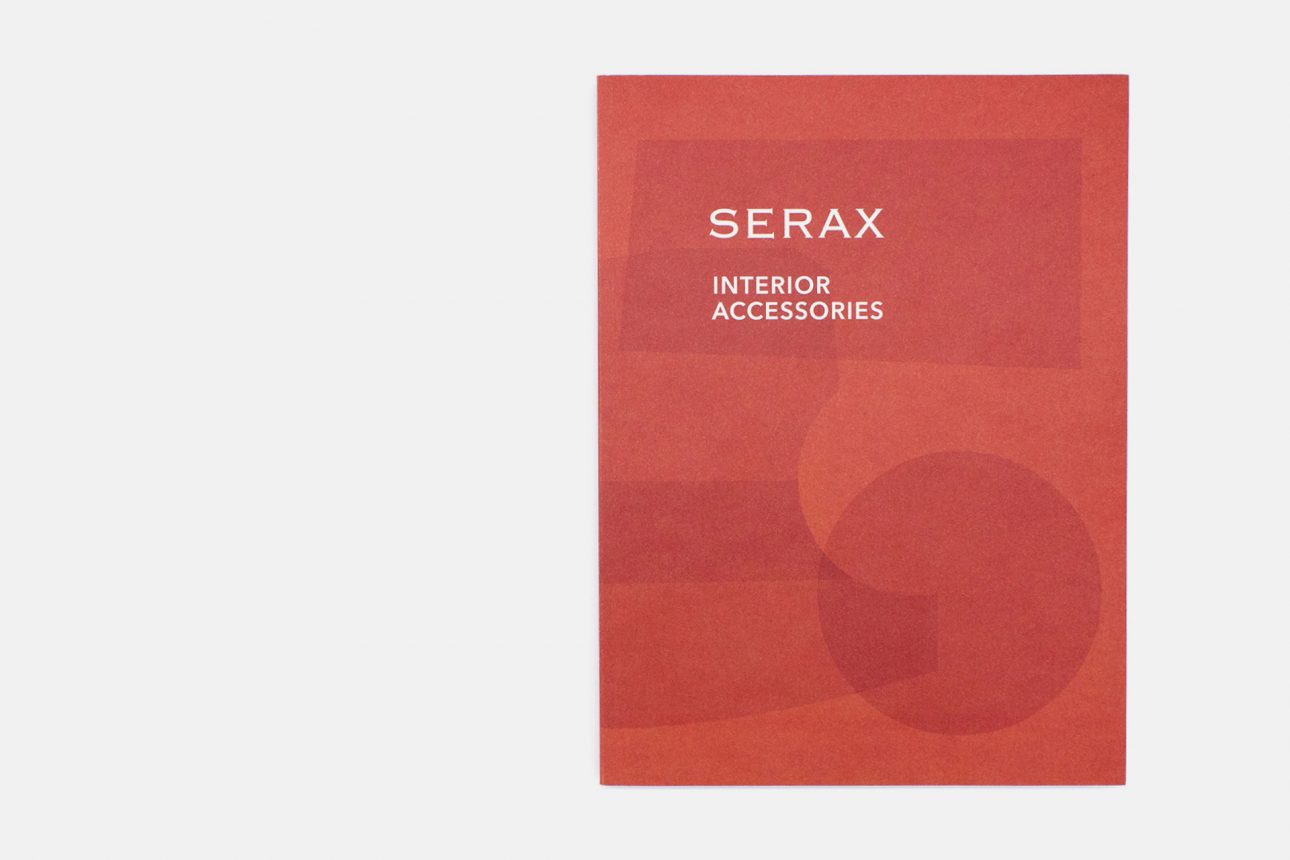
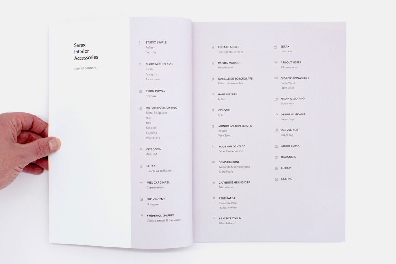
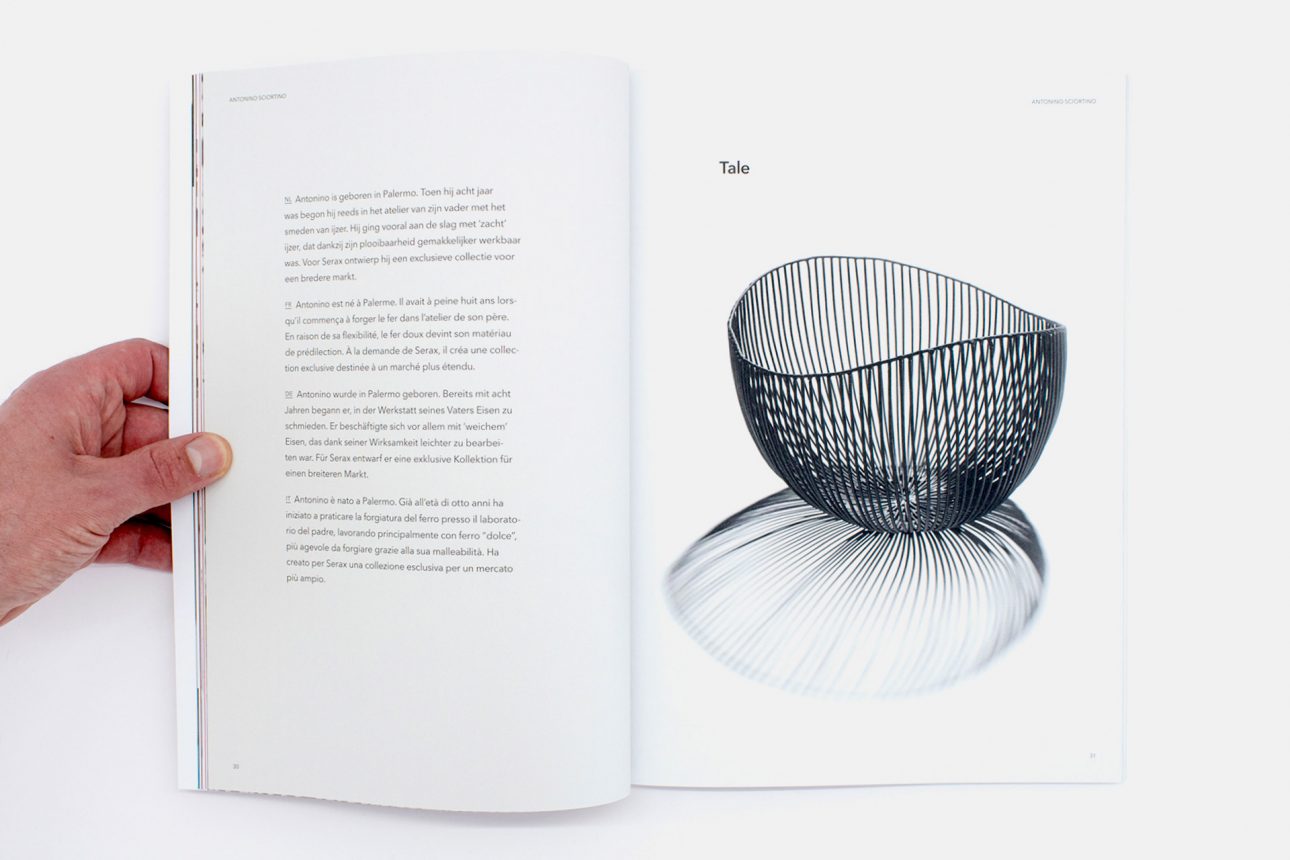
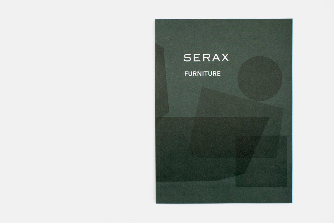
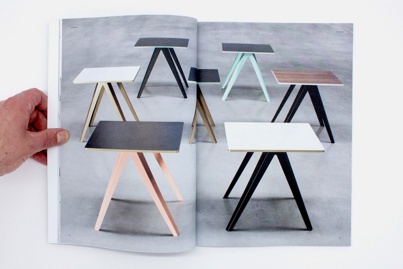
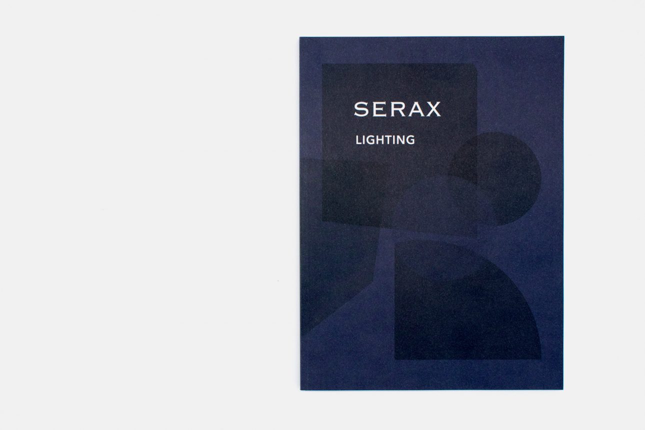
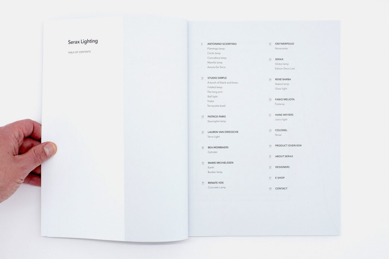
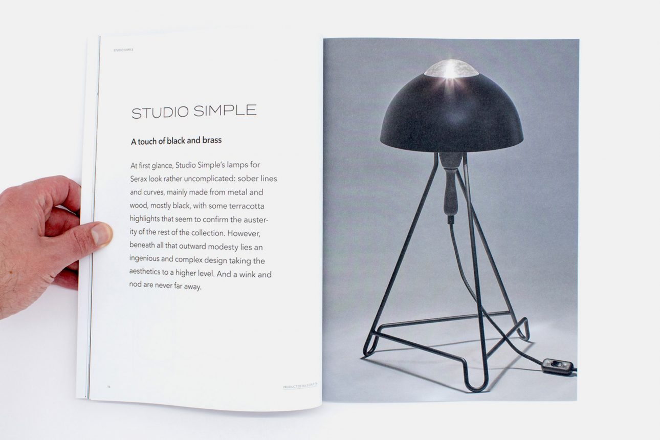
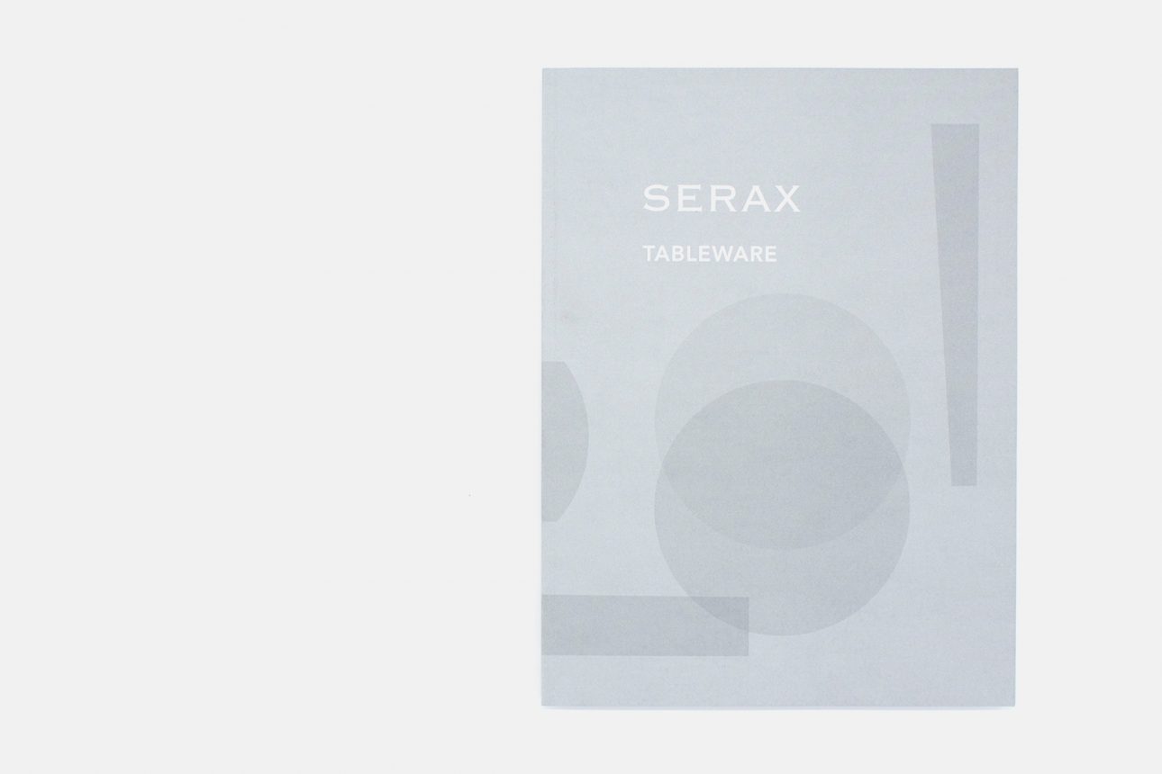
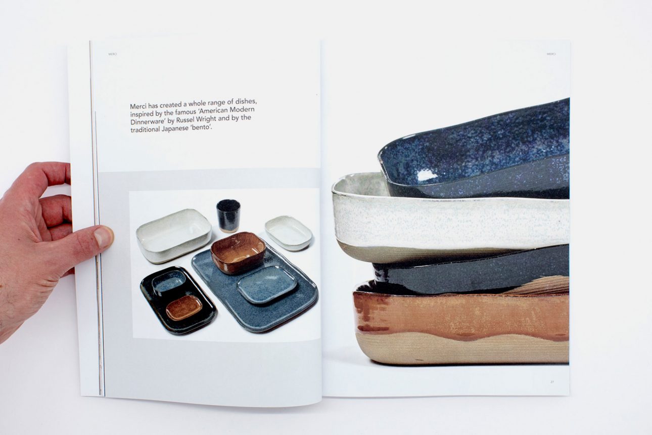
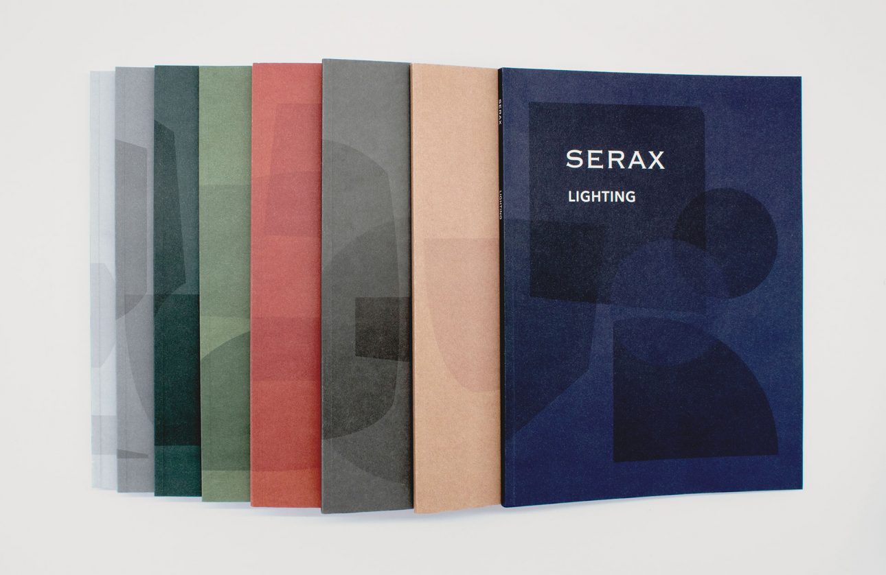
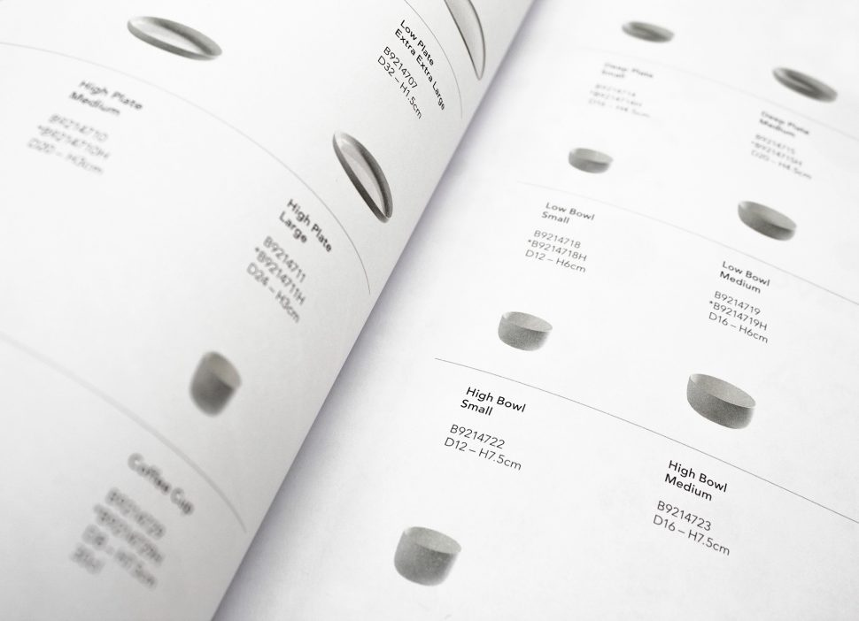
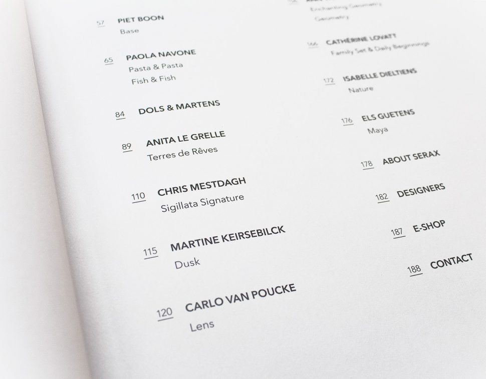
At the start of 2018, Serax wanted to present their new collections to the world. A fresh concept was needed, so the decision was made to split the collection in 8 sections. Our design gives each category its own face, and makes sure design-lovers don’t get lost in Serax’ vast collection.
Details
-
The first catalogue we designed for Serax over 10 years ago consisted of only a couple dozen pages.
-
Knowing that just print doesn’t cut it anymore, we made sure our design translate well to a digital environment too.

