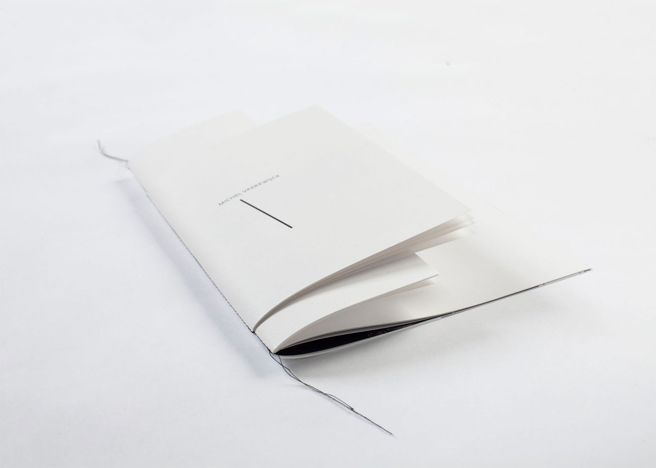
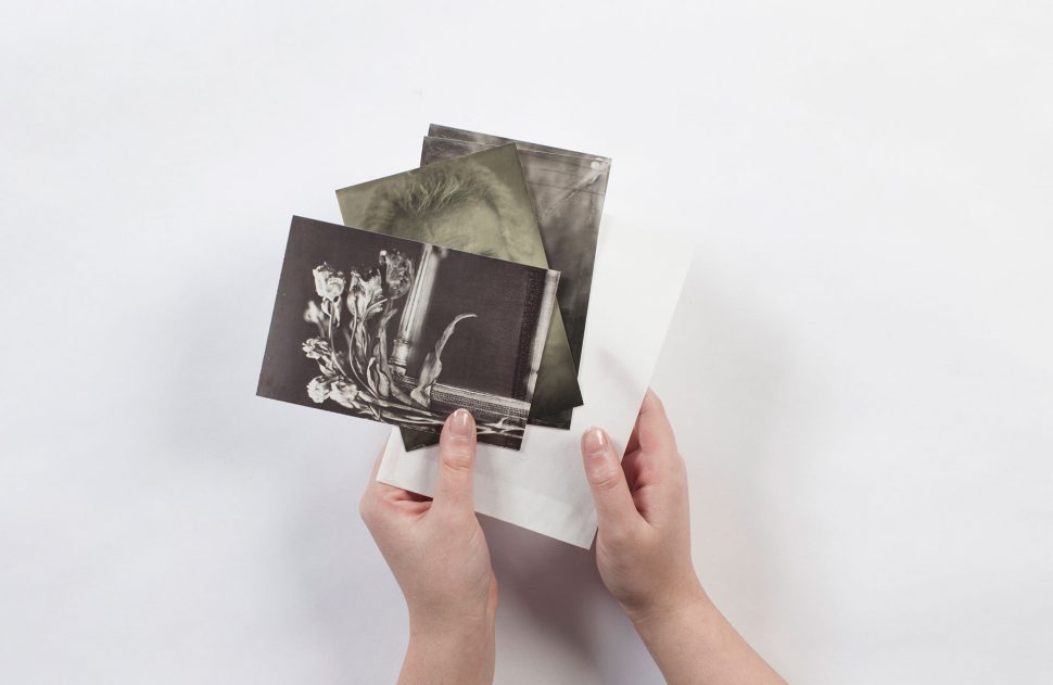
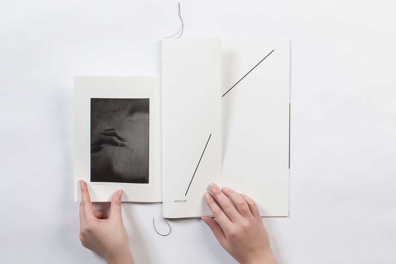
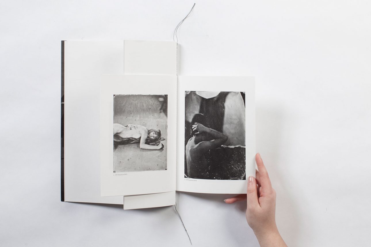
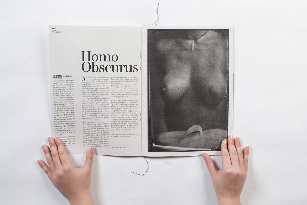
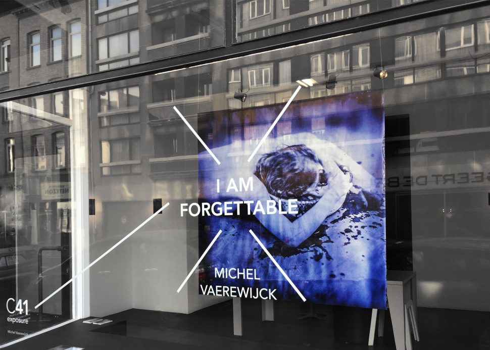
Photographer Michel Vaerewijck came to us in need of a coherent visual identity. We knew this wasn’t the easiest assignment, since the design needed to be recognizable without overpowering his images. In the end we found the perfect solution using a simple black-and-white colour palette and the graphic device of a line. For the printed matter, we combined different paper formats to attain that certain je-ne-sais-quoi.
Details
-
The publication was carefully stitched by hand
-
Undercast also takes care of all invitations for Michel’s exhibitions

